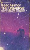


In the 1970’s, Avon Books published a series of reprints of Asimov’s nonfiction books. The titles included Life and Energy, The Neutrino, The Universe, and the first five F&SF essay collections.
These are all excellent editions. The paper is high quality and the bindings are solid; they’ve held up well over the years since I bought my copies. One of the advantages of bringing out a series of books at more-or-less the same time is that you can provide them with a matching covers. Even if you’re not publishing them at roughly the same time, you can still do this—Houghton-Mifflin did so with Asimov’s history books with the exception of The Greeks and The Egyptians. On the whole, however, it’s common with vaguely simultaneous publication. There, the examples are rife—almost all of Asimov’s books published in paperback or as ebooks belong to one batch or another with matching covers.
In this case, we have a relatively clean design using a variant of Helvetica as the typeface. (Yes, I am a font geek, but I deal with the technical end of things. I don’t have enough of an artistic eye to distinguish the various Helvetica clones from each other.) The cover of The Universe has the Horsehead Nebula, but the others all have artist renditions. Life and Energy has some leaves and a man, a cell from each, all superimposed on the Sun.
The others presented more of a challenge for the artist. A neutrino is something rather difficult to visualize, and the F&SF essay collections are a pretty miscellaneous bunch with no single topic. In the end, they turned to astronomy. The Neutrino gets a picture of the Sun (the closest source of lots-and-lots of neutrinos, after all), and the F&SF collections all get something space-y. The art is very nice, and the overall effect is a positive one.
There is, however, more to a cover than a good design and nice art. You’ve also got the put the author’s name up there somewhere, not to mention the title. The tendency was (and is) to make Asimov’s name pretty prominent, since that’s what sells the book. Hopefully, you spell it correctly. As for the title, well, you do the best you can, and hopefully you get that right, too. Actually, that’s a little strong, since both are almost always correct—almost always, but not always.
Take the Avon edition of Of Time and Space and Other Things, for example. The title is correct on the title page, but on the cover and and spine it comes out as Of Time, Space, and Other Things.
It’s an easy mistake to make, because the book’s actual title doesn’t really follow what’s considered standard written English but the erroneous title does. The problem is that, like all good writers, Asimov knows when it’s more effective to break the rules than to keep them. In this case, it’s a matter of prosody, of rhythm and stress.
Asimov’s title has a nice, rhythmic alteration of unstressed and stressed syllables: of TIME and SPACE and O-ther THINGS. It has a semi-poetic feel to it and is a very good title as a result. Asimov’s titles for the early F&SF essay collections tend to the poetic: Fact and Fancy, From Earth to Heaven, and so on. It was tough to keep this up, and eventually he abandoned it.
The erroneous title, however, has two stressed syllables on a row: of TIME, SPACE, and O-ther THINGS. English is OK with two unstressed syllables in a row, but two stressed syllables is always awkward and rarely poetic. In this case, one must agree that Asimov’s instincts are right and those of the graphics artist who put the cover together are wrong.
It’s still a very nice cover, though.