On 22 March 1951, Asimov had lunch with his editor at Doubleday, Walter I. Bradbury, and his then-agent and good friend, Fred Pohl. Over the course of the meal, someone—Asimov doesn’t say who, but I rather suspect it was Pohl—came up with the idea for a series of juvenile novels.
Television was on its way in as the next big thing in entertainment, and anybody who got in on the ground floor of a successful program might do very well, indeed. So might their publisher and their agent. Now, radio had been known for its long running series—“Little Orphan Annie,” for example, or “The Lone Ranger.” “The Lone Ranger” had been going for over eighteen years and showed no signs of stopping. Maybe a series of books about a “Space Ranger” might meet with comparable success?
Certainly it seemed worth a shot. Asimov’s one concern was quality. He’d seen some television and hadn’t been impressed with anything other than Sid Caesar’s Your Show of Shows. Maybe Hollywood would take the “Space Ranger” and turn it into something Asimov would not want to be associated with.
As it happens, “Rocky Jones, Space Ranger” was going to arrive on TV screens in 1954, and it’s exactly the sort of thing Asimov was hoping to avoid. Some episodes were eventually re-edited into movies, and the movies have in turn been incorporated into episodes of Mystery Science Theater 3000, one of which is available (as of late 2010) on DVD and various electronic services such as the iTunes store. (You can also get it without Joel and the bots, but why would you?) Watching “Crash of the Moons” gives one a sense of just how justified Asimov’s concern was.
Bradbury, as it happens, had a solution: use a pseudonym. Hearing that writer Cornell Woolrich, whom Asimov admired, had written using the pseudonym William Irish, Asimov opted for a common first name and a nationality as a surname. Thus was Paul French born.
As for the hero, “Starr” had a nice, science-fictional ring to it. Asimov’s wife, Gertrude, was then pregnant for the first time and they’d already hit on “David” as a name should the baby prove to be a boy. “David Starr” seemed like a good name to go with. By the time work on the second novel started, however, Asimov had changed his mind. “David” seemed a rather too pedestrian, and so our hero gained the nickname “Lucky” which is used almost invariably from that point on.
Every hero needs a sidekick. David Starr’s came in the form of the diminutive redhead John Bigman Jones. (“Bigman”—get it? ’Cuz he’s short, you see—) Bigman is an ideal sidekick. Lucky gets to be oh, so very much smarter than the rest of us that we need an reader surrogate, someone who gets to say, “What’s going on, Lucky?”
This turns out to be particularly important in the Lucky Starr books because Asimov put in as much exposition about astronomy as he could manage. If we’re writing science fiction for kids, we should be teaching them while we’re at it. This was one of his core philosophies of science fiction and not the last time he put it into practice. In any event, we also need someone who can ask, “What’s that interesting astronomic object or phenomenon over there, Lucky?” Bigman is very good at that sort of thing.
In the end, there’s enough astronomy in the Lucky Starr books that he actually uses some of it as examples of his non-fiction writing in Opus 100.
Bigman, in addition, is smart (if uneducated), resourceful, good in a fight, fiercely loyal to Lucky, and has a nicely hot temper that can create problems when the plot demands.
As for the organization Lucky works for, well, science fiction is about Science, and although Lucky can use his fists and guns better than just about anybody else, we want him to solve problems through Science and his Brains, and so we have the Council of Science which has extraordinary powers within the government. Indeed, it practically acts as if it were the government.
Add a Cool Ship, the Shooting Starr, and a couple of minor recurring characters who can help set up the story at the beginning, and we have the basic set-up. Every week—or every novel—we can have Lucky and Bigman be sent to investigate something odd or irregular, do some snooping, fight a couple of fist-fights, and catch the bad guy at the end. With Science.
The first novel in the series, David Starr: Space Ranger, includes a couple of other elements which would quickly be dropped because Asimov just found them too puerile. One is sufficiently-advanced-technology in the form of a mask given to Lucky by energy beings who live in huge caverns under the surface of Mars. The mask gives Lucky a handy disguise and provides him with a personal force field that makes him pretty much invulnerable. The other dropped element is that, while wearing the mask, he can assume the guise of the “Space Ranger,” using a name the Martians gave him. The Space Ranger was to stay a mysterious figure, rather like a standard costumed superhero, who came and went as he chose and always got the credit for solving the problem.
(And, thinking in TV terms, the fact that the mask completely obscured his face meant that he could be played by different actors, if necessary!)
David Starr: Space Ranger includes references to pirates holed up in the asteroids, and they come back as the main villains in the second book, Lucky Starr and the Pirates of the Asteroids. Further on, we get the machiavellian Sirians, continually trying to undermine Earth and the Council of Science. (Yes, Asimov knew even in the 1950s that Sirius was a rotten star to have a human colony orbit. He wanted to use the familiar name, though.)
It was pretty clear pretty early that Hollywood had no interest in Lucky Starr. The pseudonym was not only unnecessary, but it became a positive hinderance. Some people started to assume that Asimov was half-ashamed of his science fiction and always used the pseudonym when publishing it. By the time we got to the fourth book, Lucky Starr and the Big Sun of Mercury, Asimov introduced positronic robots and the Three Laws, and if that didn’t give away who Paul French really was, nothing would.
He did have some fun in the meantime. A reviewer in one fanzine loved to bait Asimov by consistently complaining how rotten his stuff was. He did, however, praise one of the Lucky Starr books as an example of what sf should be like. Asimov took great delight in explaining exactly who Paul French was under the mask.
Asimov wrote six Lucky Starr novels over the course of the 50s: David Starr: Space Ranger, Lucky Starr and the Pirates of the Asteroids, Lucky Starr and the Oceans of Venus, Lucky Starr and the Big Sun of Mercury, Lucky Starr and the Moons of Jupiter, and Lucky Starr and the Rings of Saturn. He was thinking about a seventh, Lucky Starr and the Snows of Pluto, but in the aftermath of Sputnik, he virtually stopped writing anything but non-fiction for several years and it never materialized.
The Lucky Starr books have to be counted as minor Asimov, although they’re actually pretty good. Yes, they’re aimed at twelve-year-old boys, and so the characters tend toward the black-and-white and the action toward the non-stop. Every book has some fisticuffs, and there are exclamation points galore! Really! But the books are well-crafted and enjoyable—not on a par with, say, The Caves of Steel but more along the lines of The Currents of Space.
When I first reviewed them in the 1990s, I was a little harsh on them, but the next reading came when my son was twelve. He had read them before, and so when he saw David Starr: Space Ranger in my hands, he practically snatched it away. We ended up racing to see who would reach the end of the series first. I won by a nose. In the end, with such evidence of the appeal to the target audience at hand, there was nothing for it but to up my ratings.
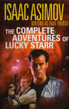 The books have a spotty publication history. They seem to be reprinted every decade or so, once there’s a new batch of twelve-year-olds to throw at them. (Maybe we’re due for another round, then, since they were last in print in 2001.) Signet came out with a set of paperbacks in the early 1970s, and that’s how I first met them. Ballantine published them again in the late 1970s, and the Science Fiction Book Club put out omnibus editions in 1985 and 2001. I also own the latter, which is a surprisingly nice edition. I bought it mostly for the cover, which shows Lucky and Bigman. Lucky looks like Lucky and Bigman looks like the love child of Ginny Weasley and Bilbo Baggins. I love it. All of the reprints restore Asimov’s name as author (with “writing as Paul French” added for good measure).
One interesting feature of the later printings is the inclusion of what can only be called errata. Asimov took getting the science of the solar system right very seriously, and he was embarrassed that the explosive expansion of planetary science which hit in the 1950s and 1960s should have outdated these little volumes so badly. He therefore added introductions to explain where the books got the science wrong. This is actually a very thoughtful thing for him to do—I don’t know of any other science fiction works which contain disclaimers specifically pointing out where the “science” fails.
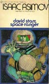
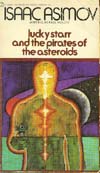 The Signet paperback reprint from the early 1970s have another curious feature. This set came out two books at a time, with David Starr: Space Ranger and Lucky Starr and the Pirates of the Asteroids the first pair. If you look carefully, you’ll note that the covers have been switched. The cover for David Starr: Space Ranger fits the action of Pirates of the Asteroids and vice-versa.
It may be a sheer accident, of course, but my guess as to what happened is this: The cover art came in and somebody at Signet noticed that whereas the cover for Pirates of the Asteroids featured David Starr’s face prominently, the art for David Starr: Space Ranger did not. That, they seem to have felt, was not a good thing. The first book should have the hero’s picture on the cover. And so the covers were swapped.
Finally, it’s worth noting that as of late 2010, the Lucky Starr novels are the earliest of Asimov’s books (not counting his dissertation) not available for the Kindle, the iPad/iPhone, or any other ebook platform. Given that a relatively small number of Asimov’s opera are still in print at all, let alone as ebooks, it’s remarkable that virtually all of his oldest books are so readily available for electronic book readers.

