All posts by tseng

What’s So Good About the Doctor?

When I started this site back in the early 1990’s, one of the mistakes I made was to assume that the bulk of Asimov fans were more or less like me. That is, I assumed that people would have something of an Asimov collection of their own and access to a public library with a somewhat larger Asimov collection, and that they read pretty much every book by the Good Doctor they could.

With this in mind, I further assumed that Asimov fans would therefore be acquainted at least in broad terms with his career and personal life. After all, not only did he write a couple of very thick autobiographies, he also talked about himself a lot in his other writing. I assumed therefore that people would know that he wrote both fiction and non-fiction, that his non-fiction was on all kinds of subjects, that Doubleday was his preferred publisher, that he was married twice and madly in love with his second wife, Janet, that he had a beautiful, blonde, blue-eyed daughter named Robyn, and so on.

That assumption may or may not have been plausible in the early 1990’s, but as time has progressed, Asimov’s books have started going out of print and there aren’t as many available in public libraries as there used to be. In any event, just because the books are available, people may or may not go to the trouble to read all of them. In particular, some people have a lot of interest in Asimov’s fiction but none at all in his non-fiction.

All this was driven home to me as I read Warren Dunn’s review of The Stars, Like Dust—. Dunn notes that one of the things that really bothered him about the book is Jonti’s smoking and surmises, “Asimov obviously smoked, at least in his youth…”

Well, no, actually. Asimov was a non-smoker his whole life.

His first wife, Gertrude, was a smoker, and naturally he knew a lot of other smokers among his friends, but he himself never took a puff. His father had been pretty strict about things like that. He was also a teetotaler, but that was in part because of his father’s influence and in part because he couldn’t handle his alcohol at all and got really drunk really easily. He endured smoking throughout his first marriage, but once he was free of Gertrude and back on his own in 1970, he became a staunch anti-smoker and did everything he could to keep people around him from smoking.

No, he included smoking in The Stars, Like Dust— and his other early fiction because there was a casual assumption in the 1940’s and 1950’s that everybody smoked. It wasn’t until the Surgeon General’s report on smoking came out in 1964 that anti-smoking campaigns took off and the percentage of adult smokers dropped.

This is something well-covered in Asimov’s various writings, yet Dunn managed to miss it. I mention this not to criticize Dunn by any means, but simply to point out that people can be very conversant with Asimov’s fiction without knowing much about the man himself. My habit in indulging in the occasional casual allusion needs, therefore, to be corrected.

(This is the main reason I included a blog when I redid the site starting in 2010. I wanted to have a way of giving some of the background information that is hopefully interesting but that doesn’t fit nicely in a review.)

Among the things I casually allude to are Asimov’s “F&SF essays.” Surely, one can’t be terribly familiar with Asimov’s writing and not know about them, right? Well, just in case—

For the past sixty years, The Magazine of Fantasy and Science Fiction (usually called just “F&SF”) has been one of the major venues for original, short science fiction (and fantasy). Asimov was asked to contribute a science column in 1958 and it continued, unbroken, until February 1992, for a total of 399 issues. A 400th was put together by Janet and published posthumously in December 1994.

The column was originally 2000 words long, but that was quickly doubled. Asimov received only nominal pay, but he didn’t mind, because he was given carte blanche as to what he would write about (even though it was supposed to be a “science column”). The various editors of F&SF over the years also maintained a hands-off policy and never touched a word that Asimov wrote for the column, so he had a bully pulpit with which to express himself on anything for nearly thirty-five years.

Not surprisingly, his columns for F&SF were by far his favorite things to write. Far from missing deadlines, he had to work hard to keep from writing too many and getting too far ahead of schedule. Since he was writing for a science fiction magazine, he was among friends, as it were, and so he could be informal and chatty. In fact, most columns start with a personal anecdote, usually with Asimov himself as the butt of the humor.

Moreover, when Sputnik was launched in 1957, Asimov devoted himself to writing non-fiction as his part in the effort to improve science education in the US. As a result, he wrote very little fiction again until the 1980’s. His F&SF column therefore also made him feel like he was still involved in the world of science fiction. Certainly the fans agreed; they awarded him an honorary Hugo for his column in 1963 (“for putting the science in science fiction”). The fans of his column, moreover, were not limited to the usual science fiction geeks. Asimov got the occasional letter from people like Linus Pauling commenting on (or correcting) his work.

When the column started, a bit of schtick developed between Asimov and then-editor Robert P. Mills. Asimov referred to Mills as “Kindly Editor,” and Mills began calling Asimov “Good Doctor” in return. The schtick was dropped when Avram Davidson took over F&SF in 1962, but by then, it was too late. The nickname “Good Doctor” was firmly established in sf fandom. Asimov made mention of the nickname frequently in his own writings, and I picked up the habit from him.

Asimov himself preferred to call his columns “essays.” For the F&SF essays, their informal and personal nature makes the term not entirely unreasonable, but he pretty much called all of his short non-fiction “essays,” too, something with which literary critics might disagree.

Every seventeen issues or so, Asimov gathered his columns together, added a short introduction, and handed the result over to his friends at Doubleday and Company to publish as a book. Why seventeen? It seems that when he was working on his first book, Pebble in the Sky, he asked his editor at Doubleday how long to make it. “Oh, about 70,000 words,” was the answer, and from that point on, 70,000 words was the “ideal” length for a book so far as Asimov was concerned. 17 columns at 4,000 words each works out to 68,000 words, so add a 2,000 word introduction, and you’re there.

Not counting the five essay recyclings (Asimov on Astronomy, Asimov on Chemistry, Asimov on Physics, Asimov on Numbers, and Asimov on Science), there are a total of twenty-two F&SF essay collections. They are:

Note that these twenty-two books contain only 374 essays. Six of the early essays Asimov didn’t care to collect, and there was no interest putting out a book with the twenty published in F&SF from July of 1990 onward after Asimov’s death. (Ed Seiler tried.)

Asimov’s enthusiasm for the F&SF essays is infectious and they are a lot of fun to read. I don’t know how many your local public library may carry, but if you are starting to build your own collection of Asimov’s non-fiction, the F&SF essay collections are an excellent place to start.

Best. Cover art. Ever.

Over the course of my career as a science fiction reader (not that it’s really been that long, being as I am only mumbledy-mumble years old and looking even younger!), I’ve seen my share of cover art.  Some of it’s been OK, some of it’s been bad, and some has been very, very good.

Getting the cover right can make a big deal to the publisher.  After all, they want you to pick up their book in your local bookstore (or online) and buy it, and anything that will make it grab your attention is a good thing.  Moreover, if a picture of a pretty girl in a tin-foil bikini can get you to buy the book even if you never read it (and even if there are no tin-foil bikinis or girls in the book), well, then the cover has succeeded, hasn’t it?

It’s unfortunate, therefore, that I can actually name so very few cover artists.  There are many whose work I’ve admired who will forever be anonymous to me.  Without delving into reference materials (i.e., Wikipedia), I can only come up with four names:

1) Milton Glaser.  Glaser, in the world of Asimov, is notable for having done the illustrations and cover for Asimov’s Annotated “Don Juan.” He also did the covers for the various volumes in the Signet Classic Shakespeare series, the reading of which inspired Asimov to do the Guide to Shakespeare.

2) Barbara Remington.  Anybody who was introduced to J.R.R. Tolkien through the 1960’s Ballantine paperback edition knows Remington’s work.  She did a series of iconic covers for the books which were so striking that Ballantine actually created a triptych from them and published it as a poster.  Unfortunately, the covers were a rush job and she didn’t have time to actually read the books before doing the artwork.  There are therefore imperfect reflections of the contents of The Lord of the Rings, something which bothered Tolkien himself, at the least.  Personally, I don’t mind; the covers are that good.

3) Frank Frazetta.  If you were a teenage boy wandering the science fiction sections of a bookstore in the 1970’s, you knew Frazetta’s work.  He specialized in covers for sword-and-sorcery fantasy-type books, and a typical Frazetta cover would include muscle-bound, dangerous-looking men, muscle-bound, dangerous-looking wild animals, and women.

Oh, the women.

It goes without saying that the average Frazetta woman was on the underdressed side.  She would, however, have fairly realistic proportions, unlike a lot of women gracing book covers.  What made her so striking, however, is that through skillful use of body language and facial expression (often shadowed), Frazetta was able make her radiate a raw, feral sensuality that is unparalleled.  A Frazetta woman looked like she might fuck you senseless, or rip your throat out, or both—horribly dangerous and infinitely desirable.

Excuse me while I go take a cold shower…

4) Michael Whelan.  Whelan won Hugo Awards for Best Professional Artist every year from 1980 through 1986, and he well deserved them.  His covers showed a rare combination of artistic talent with sensitivity to the content of the book, and some of his art is truly iconic.

Now, most Asimov books get one or maybe two cover designs, depending on whether or not they come out in paperback. His more successful books, however, got more covers than that, what with multiple editions and foreign translations.

On the whole, I don’t have multiple copies of Asimov’s books.  It’s tough enough trying to get any edition of all his books without trying to get multiple editions.  I have a number of foreign translations, either because they’re in French or Chinese, which I pretend to be able to read, or because I ran across them while traveling abroad and wanted a souvenir.  My children managed to lose one book and damage another to the point that it could no longer be read, and our budgies ate a large chunk of a third, so they were all replaced.  Beyond that, I tend to get multiple copies only if I run across an edition which has some particular interest.

As it happens, Asimov’s books with probably the most covers are the books of which I have the most copies:  the original Foundation series.  My first copies are paperbacks published by Avon in the early 1970’s.  I also have both a French and traditional Chinese translation, a hardback omnibus (without its dust jacket), an ebook set, and two additional copies of Second Foundation, one of them the original Gnome Press edition of which I stumbled across a cheap copy.

Avon paperback edition of Second Foundation

I am very fond of the Avon paperback covers.  They have a very clean design dominated by a white background.  The art is based on cubes, built out of somber colors (green, blue, and orange) with different pictures on each face.  The pictures are a little on the abstract side which helps build an other-worldly, science fiction-y feeling, and they manage to be related to the content of the book.

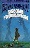
There is, however, one piece of cover art for the Foundation series which blows them out of the water, and that’s Michael Whelan’s cover for Second Foundation from the 1983 Ballantine/Del Rey edition.  A large copy of the picture is available on Whelan’s Web site.  His other two illustrations for Foundation and Foundation and Empire are very good, too, but this one, I think, beats them both hands down.

One factor which a cover artist has to take into account when creating their artwork is that the cover needs room for some text, too.  At the very least, you should have the book’s title and the author’s name.  Typically, particularly with a paperback book, you’ll have the publisher’s name, a catalog number and price, and quite probably some additional text.  This can be done either by restricting the artwork per se to a part of the cover (as the Avon edition does), or by creating the artwork in such a fashion that part of it can be obscured by the text, which is what Whelan does here.

Michael Whelan’s cover for Second Foundation

The picture is of Arkady Darrell standing on Trantor.  She’s been given red hair by Whelan, which right there tends to imply (in our usual stereotyping) an impetuous nature.  Her clothes are loose-fitting and comfortable, and they include boots and a rucksack, so she’s dressed for an outdoor adventure.  Her legs are spread almost as if she’s been caught mid-stride.  Paralleling her legs are two massive, broken metal towers in the distance behind her that stretch up into the blue sky.  In terms of color, the background is subdued—a blue sky, white clouds, haze, silvery metal, and green fields, so that the most colorful thing we can see is Arkady herself.  Even though she is quite small compared to the overall picture (her head is about 40% of the way up from the bottom), she dominates it and is the center of our attention.

It’s truly a spectacular illustration for Second Foundation.  One rather regrets that prints aren’t available at Whelan’s Web site; I’d snatch one up in a flash if they were.  I did, however, the closest thing possible—I bought a copy of the book itself, the only time I’ve added a copy of a specific edition of a book to my Asimov collection for the sake of the cover alone.

Now, note that I said that this is my favorite cover art, not my favorite cover.  I’m afraid that Whelan’s art wasn’t served well by the overall design of the cover.  It’s not a bad cover, by any means, but the purple color and the odd typeface used for Asimov’s names don’t work nearly as well as the art that they’re designed to go with.

Of Avon and Covers and Titles

Life and Energy
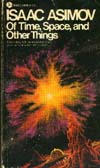
Avon cover of Of Time and Space and Other Things
Of Time and Space and Other Things
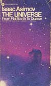
Avon cover of The Universe
The Universe

In the 1970’s, Avon Books published a series of reprints of Asimov’s nonfiction books.  The titles included Life and Energy, The Neutrino, The Universe, and the first five F&SF essay collections.

These are all excellent editions.  The paper is high quality and the bindings are solid; they’ve held up well over the years since I bought my copies.  One of the advantages of bringing out a series of books at more-or-less the same time is that you can provide them with a matching covers.  Even if you’re not publishing them at roughly the same time, you can still do this—Houghton-Mifflin did so with Asimov’s history books with the exception of The Greeks and The Egyptians.  On the whole, however, it’s common with vaguely simultaneous publication.  There, the examples are rife—almost all of Asimov’s books published in paperback or as ebooks belong to one batch or another with matching covers.

In this case, we have a relatively clean design using a variant of Helvetica as the typeface.  (Yes, I am a font geek, but I deal with the technical end of things.  I don’t have enough of an artistic eye to distinguish the various Helvetica clones from each other.)  The cover of The Universe has the Horsehead Nebula, but the others all have artist renditions.  Life and Energy has some leaves and a man, a cell from each, all superimposed on the Sun.

The others presented more of a challenge for the artist.  A neutrino is something rather difficult to visualize, and the F&SF essay collections are a pretty miscellaneous bunch with no single topic.  In the end, they turned to astronomy.  The Neutrino gets a picture of the Sun (the closest source of lots-and-lots of neutrinos, after all), and the F&SF collections all get something space-y.  The art is very nice, and the overall effect is a positive one.

There is, however, more to a cover than a good design and nice art.  You’ve also got the put the author’s name up there somewhere, not to mention the title.  The tendency was (and is) to make Asimov’s name pretty prominent, since that’s what sells the book.  Hopefully, you spell it correctly.  As for the title, well, you do the best you can, and hopefully you get that right, too.  Actually, that’s a little strong, since both are almost always correct—almost always, but not always.

Take the Avon edition of Of Time and Space and Other Things, for example.  The title is correct on the title page, but on the cover and and spine it comes out as Of Time, Space, and Other Things.

It’s an easy mistake to make, because the book’s actual title doesn’t really follow what’s considered standard written English but the erroneous title does.  The problem is that, like all good writers, Asimov knows when it’s more effective to break the rules than to keep them.  In this case, it’s a matter of prosody, of rhythm and stress.

Asimov’s title has a nice, rhythmic alteration of unstressed and stressed syllables:  of TIME and SPACE and O-ther THINGS.  It has a semi-poetic feel to it and is a very good title as a result.  Asimov’s titles for the early F&SF essay collections tend to the poetic:  Fact and Fancy, From Earth to Heaven, and so on.  It was tough to keep this up, and eventually he abandoned it.

The erroneous title, however, has two stressed syllables on a row:  of TIME, SPACE, and O-ther THINGS.  English is OK with two unstressed syllables in a row, but two stressed syllables is always awkward and rarely poetic.  In this case, one must agree that Asimov’s instincts are right and those of the graphics artist who put the cover together are wrong.

It’s still a very nice cover, though.